also known as my not wordless at all wednesday.
why I keep posting wordy tutorials on wednesdays of all days is beyond me.
As I was working on an art journal style scrapbook page for an upcoming Michelle Godin release I was stumped on my photo. I knew which one I wanted to use, and how I was going to use it, but once I actually put it on my page it just didn’t go quite right. I thought maybe black and white would be better, but no, still didn’t do. I stepped away from my page and sat and read and rocked and nursed Mason and thought. Then I thought some more. Then I laid him down for his nap, came back to my computer and stared at the page some more, and thought some more.
I knew I had to do something because not only was the color odd, it was a huge color blowout on the original photo, but it just sort of blended in and stuck out at the same time.
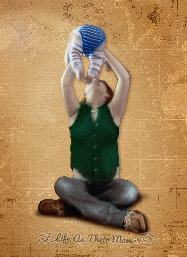
That’s when it hit me! I was not only going to convert it to black and white, I’d color in the black and white as well for a hand painted photography feel. It seemed like it would be the best feel for the page. I was so excited when I started it, then I got stumped trying to figure out how exactly best to get the effect. Well, let me show you how I did it.
(I meant for the cut out to be rough looking. I really like rough edged cut outs for art journal style pages. I feel that it lends a more realistic paper look.)
I did my cut out first, but you don’t have to do yours first – or do one at all.
I duplicated my layer and clipped into it a gradient mask that went from a dark almost black red and a very light cream. Then I clipped a curves adjustment and created a slight S in it. Merge those into your duplicate. Turn the duplicate’s opacity down to about 90%.
Create a new layer and go ahead and clip it into your duplicate. Pick your color, and a soft brush with an opacity of about 75% and paint your color over the area it goes with. Change your layer’s blending mode to overlay. I then go on to create a new layer for each color I use. Meaning, for me, each color tends to end up with three layers; my base color, my highlight color, and my shadow color.
After you’ve done all your painting go through and clean up where you painted on to other areas. I use a soft brush at 50% opacity so that some of the color is still there, that way I get the illusion of color bleeds. Also, at this point, go through and look at all your layers. Play with the opacity and blend modes on them to get them to look just the way you want. I end up going with soft light or multiply on some of mine to get the effects that I want.
You can be finished there, however I was going on to create my page so I then added a little custom shadowing.
And a more approachable example of it, a regular photo.


No comments:
Post a Comment